As soon as we know winners of the Making Santa's Naughty List Blog Hop I shall announce. Until then...
We're taking a break from author stuff to hear from Trish Owens, one of my editors from The Wild Rose Press. Every now and then she likes to stop by and share with authors a little about the green grass from her side of the fence. Well, someone tromped on her flowers because she's got a bee in her bonnet, folks. Hunker down, toss her some chocolate from a distance and heed the advice.
~Mia
~*~
It's really not that hard to format a manuscript, yet sadly, many authors seem to think the editor can fix it OR choose to use formatting as a way to show how fun and original they are.
I have two thoughts on this.
1) I won't reject a wonderful manuscript if it's formatted improperly. But when I open it and it's a pleasure to feast my greedy eyes on, I may decide to read a little more right then and there.
2) Save the originality for crafting memorable characters. This is an area where following the rules gets you more brownie points. I'm all about brownies.
A formatted manuscript is like making sure you're presentable for a job interview. An author who formats their manuscript tells me they understand the business and care about the finished product. If the writing isn't up to par I would be more apt to give them a chance at fixing their manuscript with revisions because that author has shown me he/she is willing to learn and eager to be published.
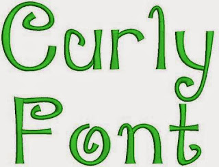
 1) NO CURLY FONTS! Not for your title, your name, or any other place in the body of the letter. Use Times New Roman (TNR), Arial, or Courier even. I don't care as long as it's easy to read. Show you are original and unique in your writing, not your font. Curly font is sort of like putting a big ole circle or heart over your i's like some girls did in grade school. Editors don't like that. Two of the manuscripts today had curly fonts. ::sigh::
But most importantly, if you're going to be published, you might as
well start learning standard formatting for your future editor. Making his/her job easier right out of the starting gate is a point in your favor. We have enough headaches. We love authors who are easy to work with and are willing to do their part. Will there be some in-house formatting stuff? Of course. But there are a few simple things you can do to make your hopefully future editor Snoopy dance with joy and eat hand out the brownies for points.
First...
 |
| There's the hidden symbol button! Click it! |
To format properly, you need to become familiar with your word processing program. Most authors use Word and I can give you hints for that. If you use something else then you need to do a Web search for the different aspects of formatting. A big help for formatting is being able to see hidden symbols. You'll turn that on by selecting a big backward P on the HOME tool bar. You'll see lots of hidden things, like spaces and returns. It's going to be a useful tool.
If you don't know your program well then find the tutorial program and take a few minutes to learn it. Learn about the Tracking feature if you're not familiar with that, either. It will come in handy for edits.
On to some formatting tips.
 1) NO CURLY FONTS! Not for your title, your name, or any other place in the body of the letter. Use Times New Roman (TNR), Arial, or Courier even. I don't care as long as it's easy to read. Show you are original and unique in your writing, not your font. Curly font is sort of like putting a big ole circle or heart over your i's like some girls did in grade school. Editors don't like that. Two of the manuscripts today had curly fonts. ::sigh::
2) NO COLORS! Choose black like my evil heart.
3) NO TABLES! There is no need for a table to corral your name, address and contact info. It messes with final formatting.
6) DO NOT DOUBLE SPACE AFTER ENDING PUNCTUATION! A single space after ending punctuation is standard now in the industry. I learned to type with two spaces and I adapted. So can you. I have faith. If you really can't unlearn this habit then you need to learn how to remove them.
- On the right hand corner of the HOME page, select FIND. In the box, put in two spaces. You won't see them. Trust they're there.
- In the REPLACE box, put one space.
- Then click REPLACE ALL, and follow the prompts. All of the double spaces will be removed.
 |
| Here's the paragraph box! Note the little box under the word After. |
4) NO TABS! Learn how to indent the first paragraph. I'll give a quick tutorial.
- Under PAGE LAYOUT, select PARAGRAPH.
- Click SPECIAL for the drop down box.
- Select FIRST LINE.
- Then move over one box and BY: select .05 (which is default.)
5) NO SPACES BETWEEN PARAGRAPHS!
- Under PAGE LAYOUT, select PARAGRAPH
- Go half way down the box to under the word AFTER.
- Click the box that says: Don't add space between paragraphs of the same style.
6) DOUBLE SPACE YOUR MANUSCRIPT!
- Under PAGE LAYOUT, select PARAGRAPH
- Click LINE SPACING
- Select DOUBLE (1.5 space isn't bad, either. Don't send it single spaced.)
7) USE PAGE BREAKS! Your manuscript looks so much more professional if you use a page break after your title page and at the end of each chapter instead of a zillion hard returns.
- Click the INSERT tab on the tool bar
- Click PAGE BREAK
8) EDITORS LIKE CHAPTERS! I know the in thing is to name your chapter something cute, but please put CHAPTER ONE above it. Or whatever chapter it is. Since you used a page break, you'll want to go down at least six returns (hit enter six times.)
- DO NOT do weird formatting things with your chapters. It messes up formatting at the very end of the process. Just type CHAPTER, then type out the number. Very easy. Do not use bold, or curly letters, or colored fonts, or tables. Just type it.
9) DO NOT ADD EXTRA SPACES AROUND PUNCTUATION! I get lots of manuscripts where they add tons of spaces around punctuation. Ellipses and em dashes get the most abuse and I have examples below of what they should look like. Most formatting programs that turn your Word document into Kindle or Epub formats will do what they need to do to make it look good.
- An ellipse is three periods in a row. Like this...and if you use it in a sentence as I did, you do not put spaces around it... But if you use it to end a sentence, you do put spaces around it. You can program that to happen when you start typing more than one period, but I have no clue how I did that.
- An em dash is used instead of a semi colon for lots of things--and is made by putting two small dashes together. No spaces around them. You can program Word to change the two dashes into one long one. Again, I forget how. But if you do them the same way each time, it's easy at the end of the editing process to search and find two dashes--and replace them.
10) USE HARD RETURNS! A hard return is basically hitting the enter key. But some people will hit the shift key AND the enter key, which creates a soft return. This messes with formatting. Don't do that. You'll see them if you use the hidden symbols button.
To remove soft returns...
- In FIND use ^l (that's a lower case L)
- In REPLACE use ^p
That's it! I hope that was helpful and you all run right over to the computer and format your little hearts out. If you have any questions, ask away!


4 comments:
Great advice in this guest post. I take a small exception to No. 9. There's an excellent post on this issue at APvsChicago: http://www.apvschicago.com/2011/05/em-dashes-and-ellipses-closed-or-spaced.html As a journalist of 20 years, I still think of the em dash and ellipses as "words." But as noted above regarding double spaces at the end of sentences, you *can* change your old habits.
Hi Dave. Thanks for the article. I love pieces like that. I've looked through CMOS online for spacing around both punctuation examples and couldn't find anything regarding this. That doesn't mean it's not there somewhere. It just means I didn't find it. :-) I would say that how I use ellipses is a house style thing.
One thing I would point out is when you change a manuscript to e-reader formats, spacing ellipses out in e-publishing could result in a possibility of the punctuation to be broken up onto different lines. I'm not sure since we don't style our manuscripts the other way and it's not an issue.
I think the most important thing is to be consistent so it can be found easily in a search and replace function if the editor wishes to change it for whatever reason.
Thanks for commenting and stopping by!
Trish
Very helpful!! Thank you! I am a bit shocked that someone would turn in a manuscript in curly font or a color other than black.
Hi Kaylyn,
TWO with curly font scattered throughout the manuscript. Not the whole thing, thank goodness. One with a table with colored borders.
I know the above makes me sound like I'm not really fun. I am. Honest. ::handing out party hats and brownies::
Post a Comment
Thanks for stopping by and leaving a comment! I appreciate hearing from you.